
Wyche Studios
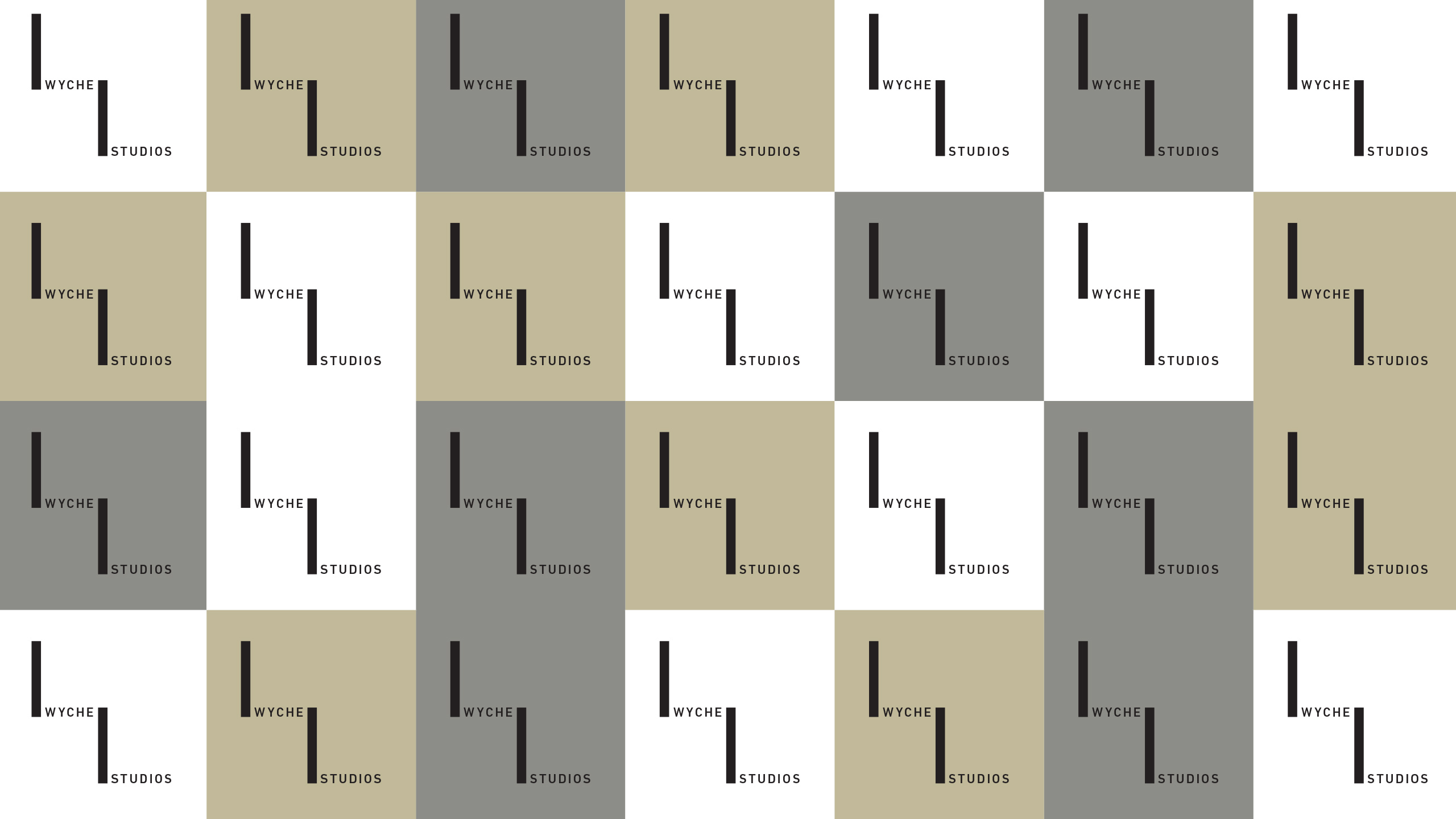
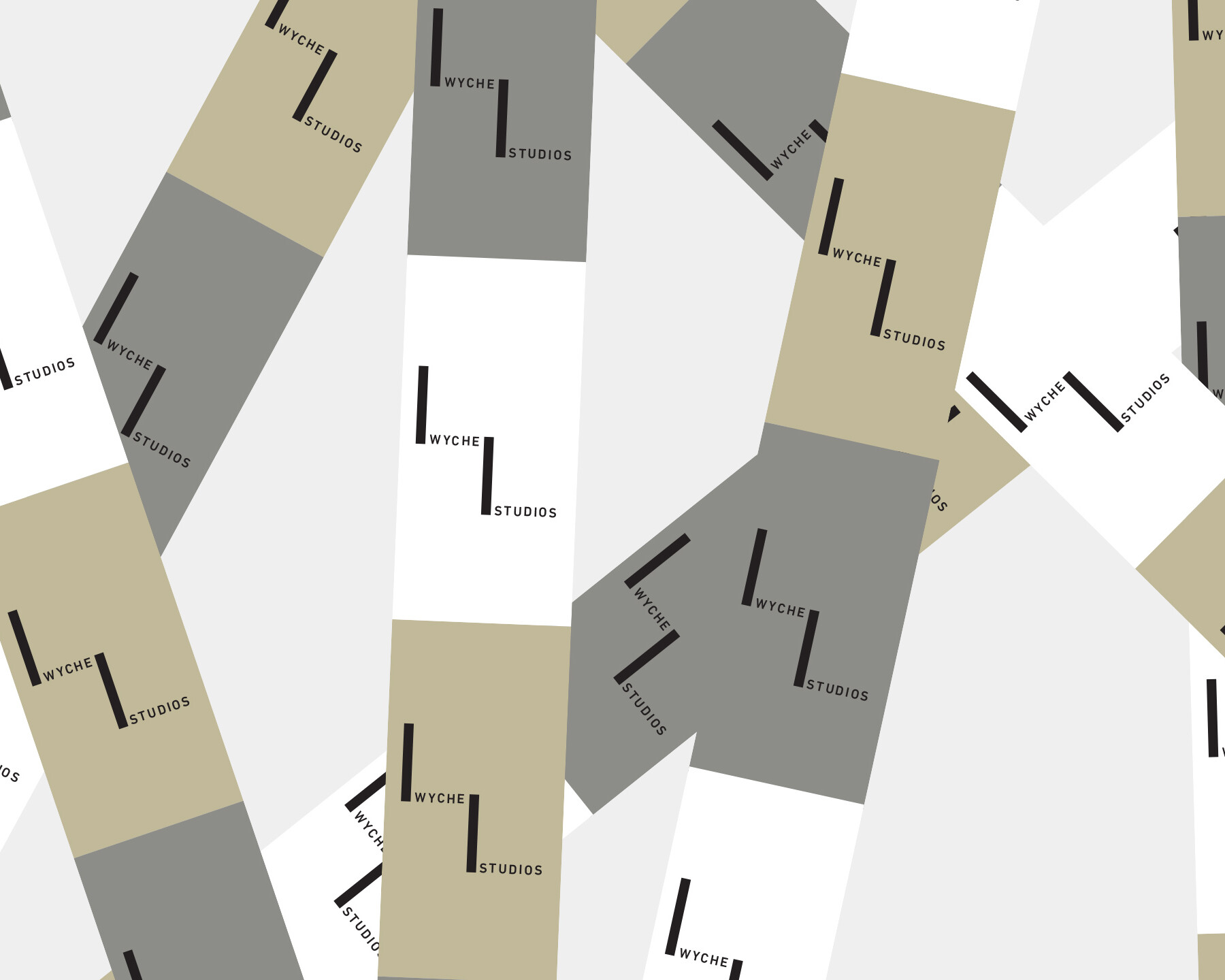
Identity for Wyche Studios. The mark uses two offset vertical bars to form an abstract W, while referencing the structure of film strips through their connection between the words Wyche and Studios. The connecting forms represent photography as the foundation of the studio’s practice, creating a minimal identity that reflects its work across visual storytelling and image-making.
Client: Wyche Studios
Project: Identity